Design apps clients pay $4,500 for. In Claude.
The 8 steps behind two client apps designed in Claude: Tolka ($4,500) and Sportefy ($3,500). Rules, brief, style, patterns, 3 screens, the system, one flow, then a clickable prototype. Every prompt is below.
 Learn this with us in UpscalePosted byZee @zeeuiuxApps & UI
How do you design a mobile app with Claude?
Write a rules file first (margins, tap sizes, type, contrast) and a real brief. Choose fonts and colours, borrow patterns from apps people know, and design just 3 screens. Lock those into a design system inside Claude, build one flow at a time, then link every screen into a clickable prototype. This is the process behind client apps we sold for up to $4,500.
Have these ready.
- 01.One Claude Project for the app. Run every step in it, so Claude keeps the rules and the system.
- 02.Your brief: who it's for, the one job, the promise and what must be true.
- 03.Your fonts and colours, or a few you like.
- 04.A free reference library: Lazyweb or Banani. No library? Screenshot the same flow in the 3 best apps in your space.
Rules before the first prompt.
Write the rules once and make Claude read them before every screen. Swap Sportefy's numbers for your app's.
Write rules.md: margins, tap sizes, type, one main action, contrast. Read it before every screen.
Use numbers, not adjectives
- Layout: side margins and an 8pt spacing grid
- Taps: 44pt minimum, bigger for the main actions
- Type: one font, 5 sizes at most
- Actions: one filled button per screen
- Colour: the brand colour only where you act
- Contrast: 4.5:1 for text, 3:1 for icons
- Content: real names, places and numbers
- States: empty, loading and error
Sportefy's: 20pt margins · search 60pt tall · quick actions 87×81 · Google Sans 34/22/18/16/12.5 · the arrow is the only filled button.
After each screen, tell me which rule it breaks.
| Rule | On the real screen |
|---|---|
| 20pt side margins | Same on every screen |
| Tap targets 44pt+ | Search 60 · actions 87×81 · tabs 91×50 |
| One font, clear sizes | Google Sans · 34 / 22 / 18 / 16 / 12.5 |
| One main action | The arrow is the only filled button |
| Contrast 4.5:1 or more | Headings on grey · 16.8:1 |
| Real places, real numbers | Elixir Arena · North Nazimabad · 1.0 km |
A brief, not a vibe.
Give Claude who it's for, the job, the promise and what must be true. Then let it ask before it designs anything.
Here's the brief. Ask me 5 questions, then wait for my answers.
Who: People at Karachi companies.
The job: Book any sport in five steps.
The promise: Your company pays. Your people choose.
Must be true: Invite colleagues with one code.
Ask the 5 questions that would change the design most, like who pays, what happens when the credits run out, and which phone comes first.
Then write brief.md: the users, the one job, the 3 flows that matter, the screens they need, and what's not in version 1.
| Sportefy for Business | |
|---|---|
| Who | People at Karachi companies. |
| The job | Book any sport in five steps. |
| The promise | Your company pays. Your people choose. |
| Must be true | Invite colleagues with one code. |
Fonts and colours before screens.
Lock the type, the colours and the icon style first, so every screen starts from the same look.
Use Google Sans, these 6 colours, 3D icons for sports and line icons for actions. Purple only where you act.
- Purple #5D039D: buttons and anything you tap to act
- Violet #8C3FC5 and Orchid #C77BE3: accents, never text
- Deep #22073D: dark cards
- Ink #15101D: text
- Ground #F3F2F6: background
Type sizes: 34 / 22 / 18 / 16 / 12.5. Give each size one job.
Make style.md: the type scale with sample text, colour chips with hex and contrast, the icons, one filled and one outline button. Show me before you design any screen.
| Name | Hex | Use |
|---|---|---|
| Purple | #5D039D | Buttons and actions |
| Violet | #8C3FC5 | Accent |
| Orchid | #C77BE3 | Accent |
| Deep | #22073D | Cards |
| Ink | #15101D | Text |
| Ground | #F3F2F6 | Background |
Borrow patterns, not looks.
Study the flows people already know, list the patterns, and keep your own look.
Use Lazyweb to study booking flows people already know. List the patterns. Don't copy the look.
Look at 4 or 5 booking apps, like ClassPass or Playtomic. For each one, check how you pick an activity, how places are listed, how times are shown, how you pay and how you invite friends.
Give me a table: pattern · apps that use it · why it works · use it here? (yes or no, and why).
Sportefy kept 4
- Credits, not prices
- Slots in a grid
- One code to invite
- Balance on a card
| Library | What you get |
|---|---|
| Lazyweb | Free. 281k+ real screens, including onboarding, paywalls and checkout. Its free MCP works with Claude. |
| Banani | 100+ screens. Free, no sign-up. |
| Mobbin | The biggest library. Its MCP needs Pro or Team. |
| No library | Screenshot the same flow in the 3 best apps in your category and ask Claude for the patterns. |
Design 3 screens. Only 3.
Home, Venue and Pick a time. Nothing else until these three feel right.
Design only 3 screens: Home, Venue and Pick a time. Nothing else until these feel right.
01.Home: credits on a card, search, quick actions, nearby venues
02.Venue: photos, sport, distance, one Choose a time button
03.Pick a time: date chips, time slots in a grid, one Confirm button
Real content only: Elixir Arena · North Nazimabad · 1.0 km, real times, real credits.
Follow rules.md and style.md. iPhone size, 390 × 844.
After each screen, tell me what you'd change, then wait for me.
Lock the system inside Claude.
Turn the 3 screens into a design system. From here on, Claude only uses its colours, type, spacing and parts.
Turn these 3 screens into a design system: colours, type, spacing, parts. Use only this from now on.
Tokens: the 6 colours, the 5 type sizes, spacing 4 / 8 / 12 / 16 / 20 / 24 / 32, two corner radii, one shadow.
Parts, each with its states (default, pressed, selected, disabled):
Search bar · Date chips · Time slots · Quick actions · Primary button · Venue card · Credits chip · Segmented control · Bottom bar · Tab bar
Show it all on one board and save it as system.md. If a screen needs a part that isn't here, ask me first.
One flow at a time.
Design one full flow with the system before starting the next.
Using only the system, design the booking flow: activity, venues, venue, time, booked.
01.Activity: a sheet over Home with the 3D sport icons and one Show venues button
02.Venues: a list with distance
03.Venue: photos, details and one Choose a time button
04.Time: dates, slots and one Confirm button
05.Booked: what, where, when and credits left
One job and one filled button per screen. Same header and back button on every step.
Design the hard states too: no slots that day, not enough credits.
Then list every part you used and flag anything new.
The whole app. Make it clickable.
Finish every screen with the system, then link them into one clickable prototype. Sportefy: 13 screens, 2 flows, 1 link.
Finish every screen with the system, then link them into one clickable prototype.
Booking: Home · Choose activity · Venues · Venue · Pick a time · Pick a slot · Review · Booked
Team + account: Invite · Join a game · Membership · History · Profile
Build it as one HTML page
- the phone on the left, the screen list on the right; click a name to jump to it
- every button, tab and card that looks tappable goes somewhere; back goes back
- a Restart button
Then click through every path yourself and list any dead ends.
Check it before the client does.
- Side margins are the same on every screen.
- Every tap target is 44pt or bigger.
- One font, a few clear sizes.
- One filled button per screen.
- Text contrast is 4.5:1 or more.
- Real names, places and numbers. No lorem ipsum.
- Every screen links to the next in the prototype.
Learn AI with us, every day.
Upscale is the AI Creative Club on Skool, hosted by Zee and Bilal. This guide is one lesson. The club is where we keep going.
- Daily video tutorials
- New AI tools tested every week
- A room of creatives sharing wins, work and new finds
My rules.md.
Add it to your Claude Project as a file. Swap the Sportefy values for your app's.
rules.md
Read this before every screen. Check every screen against it.
Layout
- Side margins: 20pt, the same on every screen.
- Spacing: an 8pt grid (4 for tight spots).
- Tap targets: 44pt or bigger. Main actions bigger still.
Type
- One font, 5 sizes at most, one job per size.
(Sportefy: Google Sans · 34 / 22 / 18 / 16 / 12.5)
Colour and actions
- One filled button per screen. Everything else is outline, text or icon.
- The brand colour only where you act.
- Contrast: 4.5:1 for text, 3:1 for icons and large text.
Content
- Real names, places and numbers. Never lorem ipsum.
- Design the empty, loading and error states too.
Take it with you.
The files for this guide. Free.
More free guides
Newest first50 Claude animations. Free (3D included)
One prompt for each. 20 are in 3D.Open the guide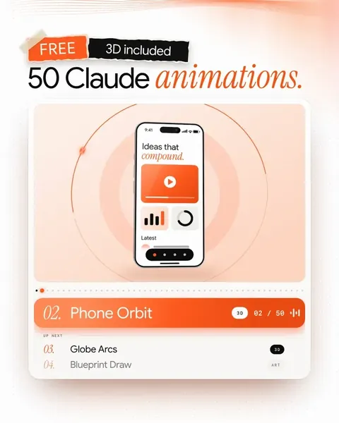 1/50Video & reels
How we made a 3D logo reveal with AI.
A real brand video. 10 steps and 10 prompts.Open the guide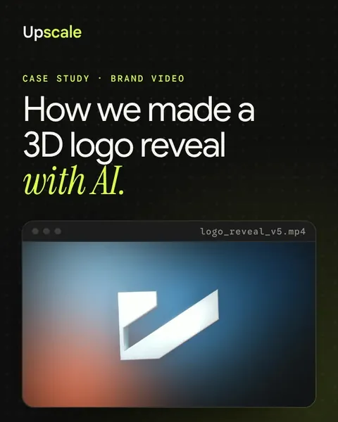 1/10Apps & UI
Design a full app in Claude, the easy way.
5 steps, 5 prompts and one checklist.Open the guide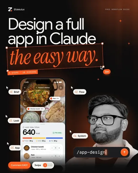 1/9